How to manage maps
In the data display panel, click on the tab 'Map'

Basic functionalities
On the left-hand side of the map, the following functionalities can be used:
- toggle outermost regions: click on the button
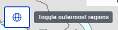 to display the EU outermost regions. These will then be displayed on the right-hand side of the map.
 - zoom in and out: you can use the wheel of your mouse or you can click on the buttons with the plus or minus sign to increase or decrease the zoom level. To go back to the default zoom level, click on the 'Home' button with the house

- Highlight geographical position: if you wish to put a focus on one or more countries or areas, you can select those in the 'Highlight' options located on the top-right hand side of the map. When you click on the highlight button in the left-side menu, these countries or areas will be highlighted in the map.

This will then be displayed at the bottom right-side of the map, but can be dragged and dropped in any position by you

- available flag legend: clicking on this with display a box showing the flags present in this current data selection

- display data values: click on a country or region to display the corresponding data values. A small table is displayed allowing you to compare the observation values between the selected geographical area and other geographical areas, grouped by classes.

- move the map: left-click on the map, keep the mouse button pushed, move the mouse in the desired direction, then release it
- highlight a specific class: click on a class in the legend to highlight all geographical entities belonging to that class. Click again to remove the highlight.

- change series displayed: if you have for example 'Time' selected under the series, by default the latest time period is displayed. You can change this on the top left-hand side of the map by selecting another year

Layout and display of dimensions
In order to display the map, the following configuration must be done in the data selection panel:
- the geographical area dimension must contain 'Geopolitical entity'
- the series dimension can be chosen freely, for example to display the 'Time'

Geographical level
On the top right-hand side of the map, you can see at which geographical level the map is displayed. For most datasets, this will be at the country level.

For other dataset containing regional data, this can also be at a more detailed level, the so-called NUTS (Nomenclature of territorial units for statistics) level.

If there are multiple geographical levels available in the dataset, for example countries and regions, then you can change this option in the data display panel in the drop-down for the 'Geographical level'.
For example, your map shows data on NUTS level 2, you can open the drop-down and click on 'Uncheck all'

Then use the either use the search bar to type in names of countries or regions or use the slider to select the level, for example countries, NUTS level 1, NUTS level 2.

Once you select your level, click on 'Check all' or if you used the search, tick the box in front of the country / region name. The map display will adapt automatically.
If you select only 'Aggregates', the map will not be able to display anything. In this case, the following message may appear:

If this message appears, select at least one non-aggregate, for example a country, NUTS 1, NUTS 2, or NUTS 3 region, to display the map.
Geographical entities not represented
Some geographical entities cannot be displayed on the map.Such entities are aggregates of countries, for example the EU or euro area, or NUTS regions related to a version of NUTS which is not the last (implemented) version of NUTS. So, for example, data related to 2010 version of NUTS won’t be displayable on the 2013 version of the NUTS Map component.
When this is the case, on top if the map the 'Not represented geopolitical entities' drop-down will appear. When you open it, it will list those entities and the data linked to it:

Legend
The legend is displayed at the lower left-hand side. Data is divided into so-called classes which each represents a certain range of data values. Each class has automatically been assigned a colour. This display can be changed under the button 'Format options'. Dark grey is used when no data is available.

Highlight option
Click on the button 'Highlight' to refine the display of your map. This is located on the upper right-hand side of the map

Clicking on the 'Highlight' button will show a list with the current selection of positions. In that list you can select or deselect positions using the selector field in front. To display these positions click on the 'Highlight' button on the left-hand side of the chart and they will be displayed at the bottom right.
By clicking and holding the icons with the 4 arrows, you can drag this box to any other location on the map.
Format options
Click on the button 'Format options' to refine the display of your map. This is located on the upper right-hand side.

When you click on this button, a pop-up window will appear with multiple tabs for customisation of the line chart:

General options
For information on the general options, please consult our page on how to use the format options. Please note - as displayed in the information message in this pop-up window - that the options you select under 'General options' apply to spreadsheets only. For other formats, such as CSV or SDMX, please refine your selection in the advanced settings available via the 'Download' button.
Specific options
For the map, you have 3 tabs with the following specific options

Map options
Under this tab, you can customise the following:
- data presentation: by default choropleth is selected, meaning the countries or regions are coloured in, based on the classes and colours shown in the legend. You can chose to display the data values as circles, meaning that each data value will be represented by a circle located in the country or region. The size of the circle is connected to its data value and explained in the legend
- legend type: by default, it is shown in a list with the colour in a square and the corresponding data value range. You can chose to display the legend as a gradient which then only shows the highest and lowest data points

- geographical level: if your dataset contains only data for countries, this option is not active and 'countries and territories' is selected as default. If your dataset contains also regional data, you can select the NUTS level (level 1 or 2, if available) and NUTS version for which you wish to display the data. By default, the latest NUTS version is selected.

Data displayed
Under this tab, you have the option to customise the data displayed and the data labels.
Show data
The show data provides you a way to manage the situation where a statistical data value is missing for a specific position (for example, data for a year for a country). By default, 'Selected data' is chosen, meaning the map will only display the data related to the position selected in the data selection panel. You can change this to 'Complete with previous', meaning if possible, the map will display the data related to the position selected in the selector above the map. If no data is available, previous data will be used.
An example: there is no data available for Belgium for the latest year available which is 2023. Thus, on the map Belgium will appear in grey colour to signal that no data is available. If the option 'Complete with previous' is selected, the map will display data for Belgium for the latest available year. In this case, a warning message appears above the map:

Please note: This selector is not available if there is no 'Time' dimension in the dataset.
Data displayed
The highlighted mode allows the chart to display only the positions currently highlighted. The highlighting needs to be done via the 'Highlight' button, located on the right-hand side above the line chart next to the 'Format options' button.
The summary mode allows the chart to display a summary version of the selected data.
The selected mode allows the chart to display all the positions from the selection into the chart.
Show data labels
By default, no data labels are displayed. You can change this to show the flags. In this case, if a data value for a country or region has a flag, it will be displayed on the map.
Colour palette
Under this tab, you have the option to customise the colours and classes.
Colour scale
The default is set, but you can change this either to monocolour or contrasted.
Amount of classes
This lets you set the amount of classes to be used, with a minimum of two and a maximum of 12. By default, 6 classes are selected.
Classification method
This provides information about the map classification for the currently displayed map:
- quantile (default): each interval contains the same amount of observations
- equal intervals: each interval has the same size
- custom intervals: each interval’s size limits are customisable by dragging the cursor to the desired value. You need to select this option and click on 'Apply'. On top of the map, you can then define the intervals. When setting new limits, they cannot be lower than the previous or greater than the next. Otherwise, an error is displayed.

Export, embed, and print
These functionalities are located on the top right-hand side of the map

Export map
When clicking on 'Export chart', a pop-up will appear:

In the drop-down field, different file formats are available for the export:
- image in png format (png stands for 'Portable Network Graphics')
- PDF document (PDF stands for 'Portable Document Format')
- svg vector image (SVG stands for 'Scalable Vector Graphics')
In addition, you need to decide on the chart elements to display:
- outermost regions, sea, and graticule
- PDF additional content
Once you have made your selections, please click on 'Generate file' and check your downloads.
Embed map
When clicking on 'Embed chart', a pop-up will appear

Click on the button 'Copy' located on the right-hand side of the embed code. This will automatically select all the code and copy it into the clipboard. A success message will also appear to inform you about this. If this message does not appear, it means the code has not been copied. In this case, you can also manually select the embed code with your mouse and use the copy and paste functionality of your keyboard.

Print map
You can also choose to print the bar chart using the built-in print functionality of your browser. This can normally be accessed with the keyboard combination CRTL+P, meaning to press simultaneously the control button and the letter P. Alternatively, you can also open the browser settings and select 'Print' in the list.
If available in your browser's print dialog box, make sure to adjust the print settings in a way that the full bar chart will be displayed, for example the orientation and scale.