
Eurostat offers a wide range of web tools to make it easier to visualise statistical results. Showing data at a regional and local level is often a challenge, as the information available is vast and difficult to condense.
That is why we have developed a tool called 'Regions and cities illustrated' to help you have an overview of the situation in your region compared to other regions in the EU in 2018 and over time.
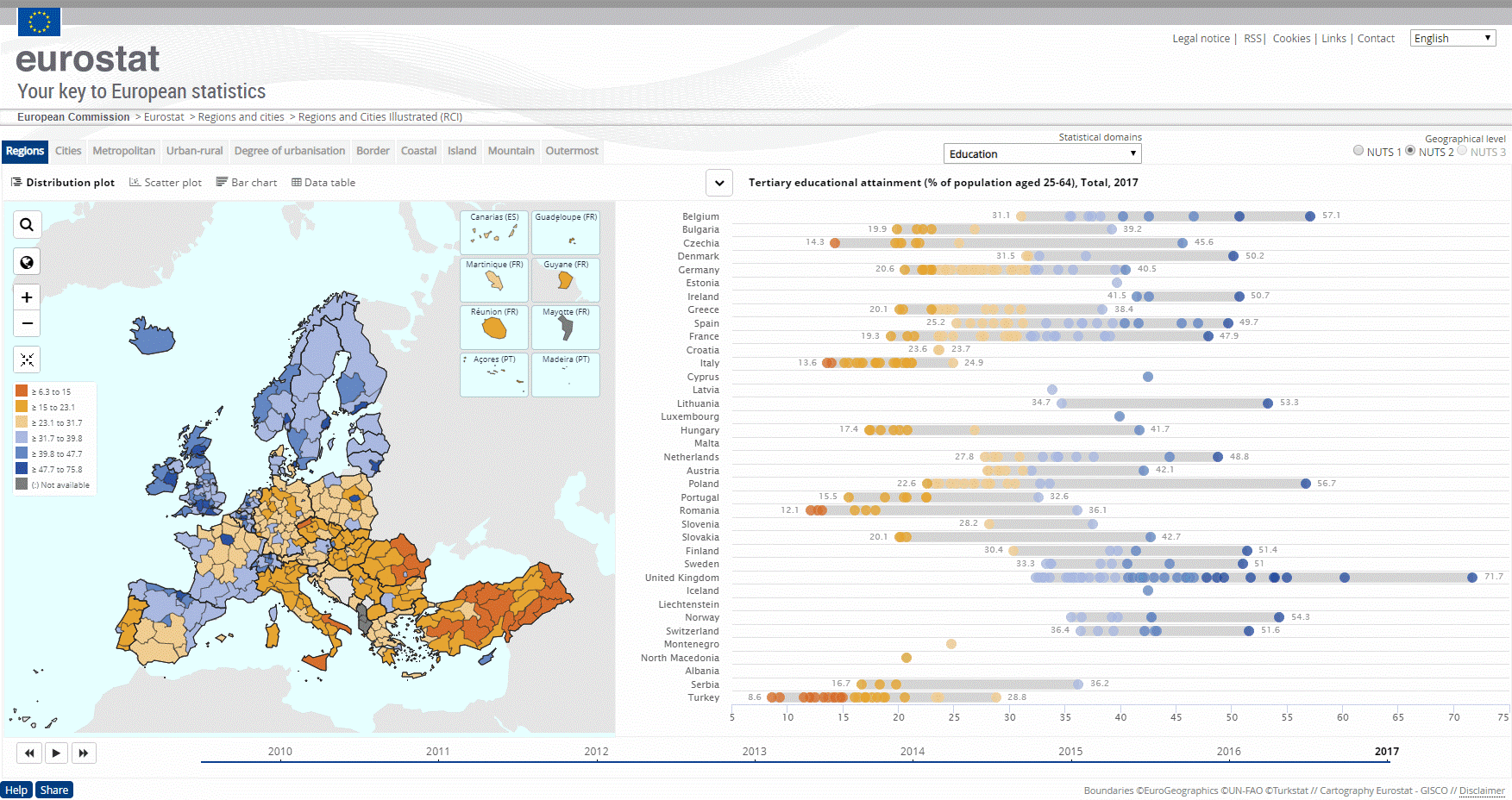
The visualisation tool is based on a live data feed, so it is continually using the latest data. It contains maps, graphs and an animated timeline together with separate tabs for regions, cities and territorial typologies.
The two main scoreboards are inter-connected, so when you select a geographical area in the map it is also highlighted in the graph.
You can now also customise the tool to suit your needs. The new features include:
- A streamlined interface allowing you to remove unused options
- Search functions for the maps and data tables
- Improved distribution plot charts showing the range of values per country
- Improved interactivity between visual elements
Why not try using 'Regions and cities illustrated' to answer questions such as:
- What is the tertiary education attainment level in your region?
- What is the employment rate among young people (15 to 24 years) in your region?
- What is the GDP of your region and how has it changed since 2010?
Eurostat has two other useful tools you can test to check out regional data:
- Statistical Atlas
- My region, a web application.
This news item is published on the occasion of the European Week of Regions and Cities, which takes place from 7-10 October 2019 at Square Brussels - Mont des Arts in Brussels. Eurostat stand will be in room Agora (level -2).
For more information:
- Overview of Regions and cities.
To contact us, please visit our User Support page.
For press queries, please contact our Media Support.