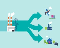
Sankey diagrams provide an overview of the main energy flows and how they contribute to the global energy balance of a certain territory.
A new version of the interactive Eurostat Sankey diagram tool is now available. Using the tool you can, for example, easily visualise energy balances, see how much energy is imported or produced in the European Union or in your country, find out where the energy is consumed and check out the principal renewable energy sources.
This new release of the Sankey diagram tool introduces some further improvements and adapts the tool to the new energy balance methodology implemented by Eurostat.
Some of the improvements relate to the location of the flows (e.g. international aviation), which have been aligned to international standards and moved next to international marine bunkers. In addition, the transformation sector now displays a higher level of detail and presents electricity production in a much clearer way.
Finally, the fuel families have been improved and more individual fuels are shown in the renewable family, for example.
For more information about the Sankey diagram tool and instructions on how to use the different menus and options, take a look at the Statistics Explained article Sankey diagrams for energy balance.
To contact us: estat-user-support@ec.europa.eu

