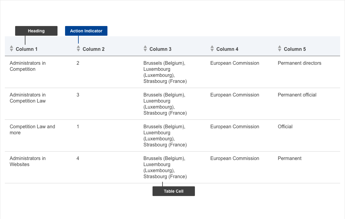
Tables are used to structure complex data in a way that makes it easier for users to scan and digest content of interest.
Anatomy
- mandatory
- optional
Default
| Elements | Mandatory | Description |
|---|---|---|
| headings | yes | columns headlines |
| cells | yes | actual data in the cells |
Conditional
| Elements | Mandatory desktop | Mandatory mobile | Description |
|---|---|---|---|
| Action indicator | no | no | if sorting is selected then users can click the action indicator to have the columns of the table sorted depending on the selection in the following fashion: - 1st click - ascending order - 2nd click - descending order - 3rd click - reset to default |
Do's
- reduce the table width to fit the content
- align content left to right within a cell
- use a dash ( - ) in null data cells
- adjusts the styling to render a small/large table
Don'ts
- don't spell out numbers
- don't use colour alone to convey information
When to use
- use when you want to store and show large/small amounts of info, static data
- use when you want to make comparisons
When not to use
- when you don't have any relationship among content you want to present
Notes
Design
- when including text links, use a different color to highlight this - just bolding or underlining the text doesn’t provide enough of a visual cue