The Horizontal menu is used as a primary navigation by Standardised and Harmonised sites and it can display up to 2 levels, further navigation (if needed) will be done via navigation lists as on the European Commission site.
Desktop anatomy
Default desktop
- mandatory
- optional
| Elements | Mandatory | Description | |
|---|---|---|---|
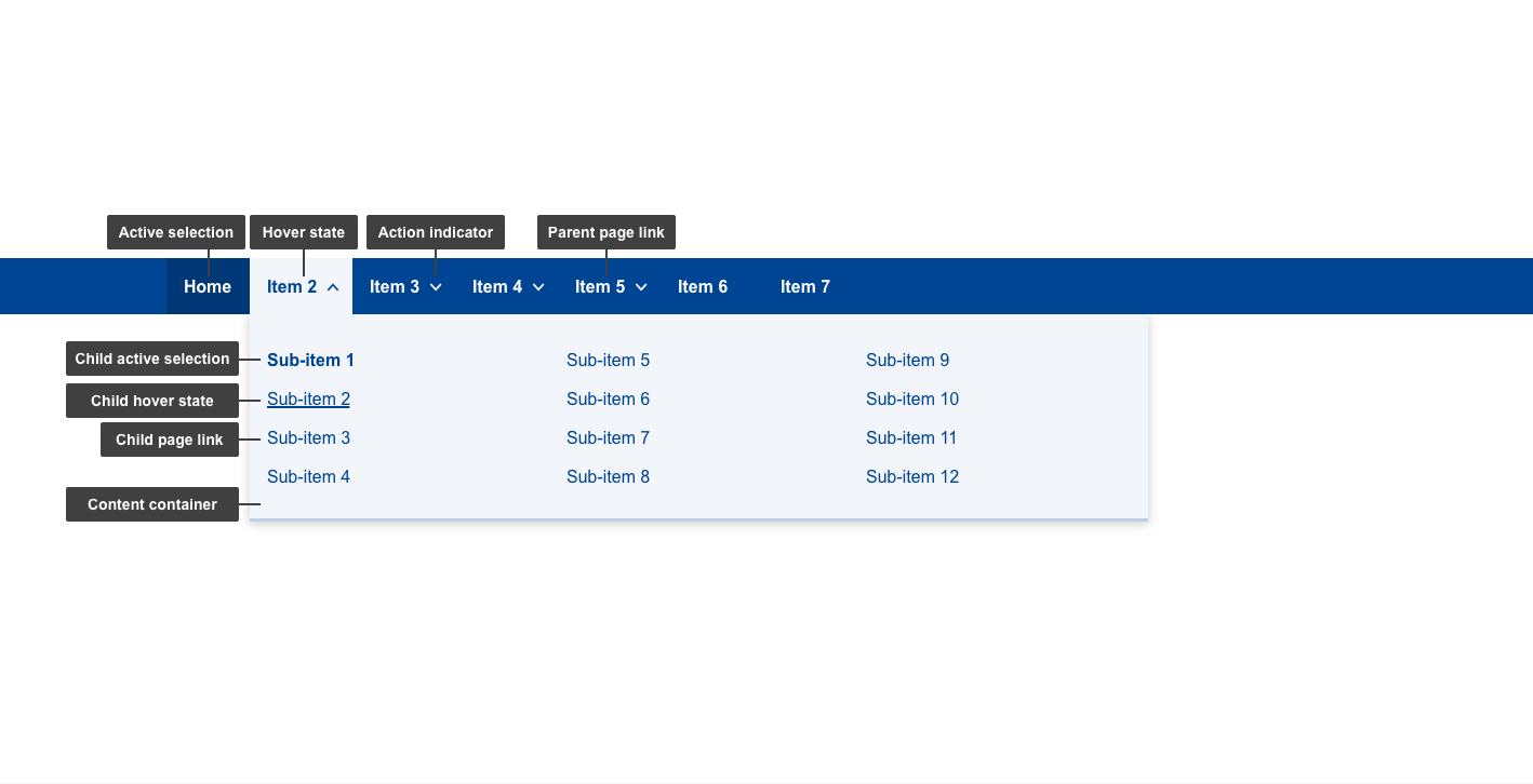
| 1 | active selection | yes | current page selection |
| 2 | hover state | yes | hover state of items |
| 3 | action indicator | yes | varies depending on the state (collapsed/expanded). Indicates whether sub-items are present and what next action will do - expands/collapses content container on hover |
| 4 | parent page link | yes | link to the parent pages |
| 5 | content container | yes | this element displays relevant content in a container that's initially hidden |
| 6 | child active selection | yes | current child page selection |
| 7 | child hover state | yes | hover state of sub-items |
| 8 | child page link | yes | link to the child pages |
Note: 2nd level items are optional, case in which action indicator will not be present (e.g. Item 6 & 7 anatomy image)
Desktop conditional
- mandatory
- optional
Note: In cases where the parent pages (labels) cannot fit horizontally within the 1140px menu, the Horizontal menu will change into a "☰" menu, hiding a vertical list.
| Elements | Mandatory | Description | |
|---|---|---|---|
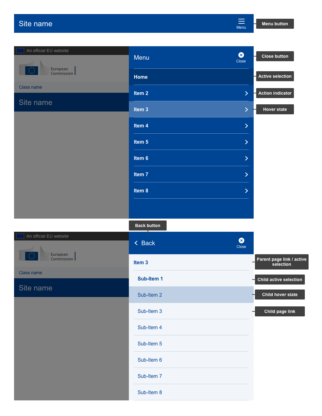
| 1 | menu button | yes | ☰ icon, clicking it opens the menu |
| 2 | close button | yes | button to close without making a selection |
| 3 | active selection | yes | current page selection |
| 4 | action indicator | yes | varies depending on the state. Indicates whether sub-items are present and what next action will do |
| 5 | hover state | yes | hover state of items |
| 6 | back button | yes | back button with action indicator |
| 7 | parent page link / active selection | yes | displays the sub-menu items under a parent page. Once the sub-menu is displayed, clicking it takes users to parent page. If there are no sub-pages, acts as a link to parent page |
| 8 | child active selection | yes | current child page selection |
| 9 | child hover state | yes | hover state of sub-items |
| 10 | child page link | yes | link to the child pages |
Mobile anatomy
- mandatory
- optional
| Elements | Mandatory | Description | |
|---|---|---|---|
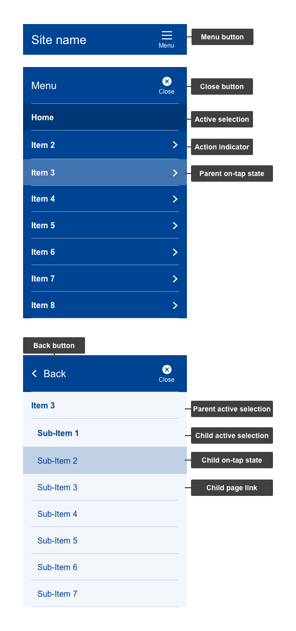
| 1 | menu button | yes | ☰ icon, clicking it opens the menu |
| 2 | close button | yes | button to close without making a selection |
| 3 | active selection | yes | current page selection |
| 4 | action indicator | yes | varies depending on the state. Indicates whether sub-items are present and what next action will do |
| 5 | hover state | yes | hover state of items |
| 6 | back button | yes | back button with action indicator |
| 7 | parent page link/ active selection | yes | displays the sub-menu items under a parent page/ Once the sub-menu is displayed, clicking it takes users to parent page. If there are no sub-pages, acts as a link to parent page |
| 8 | child active selection | yes | current child page selection |
| 9 | child hover state | yes | hover state of sub-items |
Do's
- keep first level items (parent pages) labels short, distinct and indicative consisting of maximum 16 characters, otherwise they will be hidden under a hamburger menu (☰) (for ENG labels, keep in mind a 20% buffer for other languages)
- keep second level items (child pages) labels short, distinct and indicative consisting of maximum 32 characters (ENG labels, keep in mind a 20% buffer for other languages)
Don'ts
- do not use for anything else except the website's main navigation
When to use
- use for primary navigation
When not to use
- when you only have a one-page site