A media gallery is a collection of images, videos or audio files that allows a user to quickly browse media related to the page content. The media gallery can include multiple types of formats and sometimes act as links to other pages or sites.
Anatomy
- mandatory
- optional
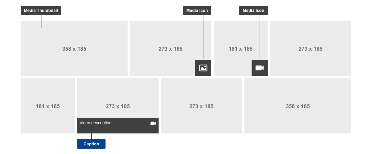
| Elements | Mandatory | Description |
|---|---|---|
| media thumbnail | yes | thumbnail representative of the linked media |
| media icon | yes | icon indicating the type of media |
| caption | no | use caption indicative of the media linked content - this allows users to form a mental model of the information available * see notes |
Do's
- always include thumbnails
- always include ALT tag
- write captions that are short, distinct and indicative and communicate the subject of the media content that is linked
- select appropriate images for media thumbnails, they need to depict what is in the audio or video file
- select matching icon overlays to indicate the type of media, i.e. audio icon, video icon
Don'ts
- don't automatically play audio or video files when a user arrives on a page (or scrolls to a media gallery)
- don't automatically play next items after an audio or video item finished
- don't choose images which are too complex to be distinguished in thumbnail size
When to use
- where there are several media files - if there are under 5 items, use an unordered list or a media container
- where there is no need to prioritise or highlight specific media files, i.e. files are equally important in terms of content
When not to use
- do not use the gallery when media items have a content hierarchy
- do not use the gallery when specific items should be highlighted
Notes
Accessibility
- make sure the ALT tag for each media file accurately describes the subject (such as for an image: "Undergraduate student looking into microscope to examine specimen in biology laboratory" instead of something generic like "Science image 1")
Design
- captions
- desktop: display on hover
- mobile: display under the thumbnail
Overlay
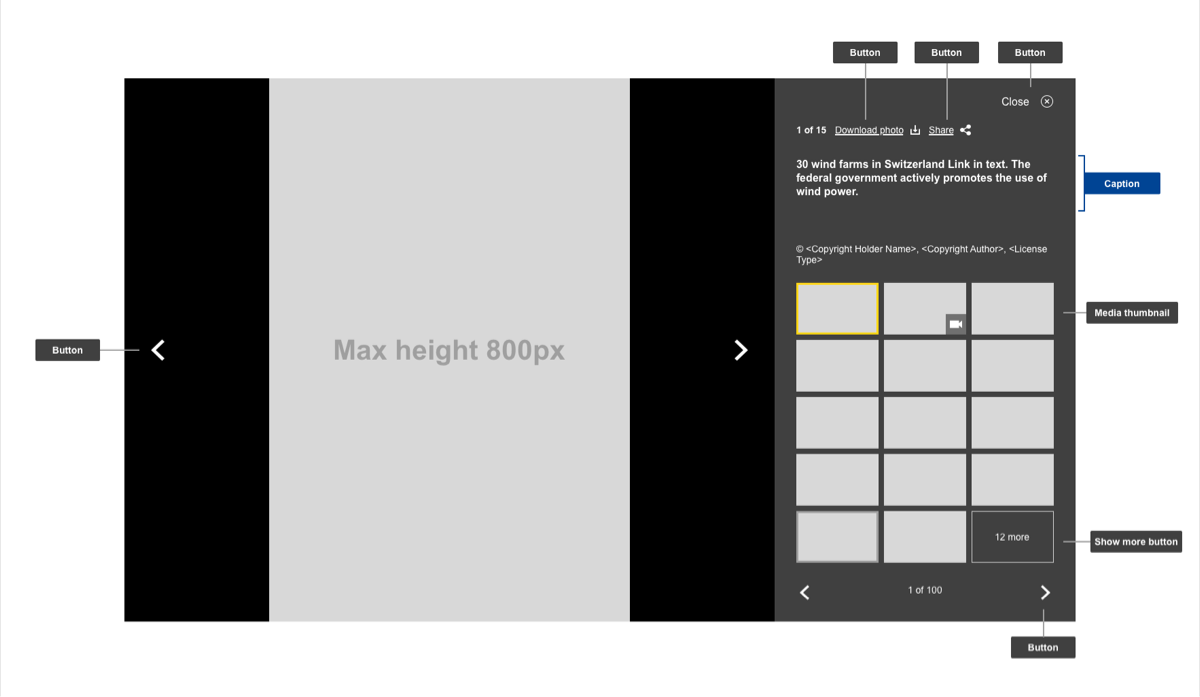
The media gallery overlay component represents the interaction interface. It is complementary to the gallery component. Through the component users can view, download and share items present in the media gallery. All information displayed in this component is pulled directly from the gallery component and therefore offers no interaction through the CMS.
Anatomy
- mandatory
- optional
| Elements | Mandatory desktop | Mandatory mobile | Description |
|---|---|---|---|
| (change picture) button | yes | yes | button that let's you scroll through all media content |
| (download) button | yes | yes | button that downloads the picture/video currently on display |
| (social media) button | no | no | social media share button, opens Social media pop-up |
| (close) button | yes | yes | closes the gallery overlay |
| caption | no | no | caption that explains the media content being linked to |
| media thumbnail | yes | no | thumbnail that represents the media being linked to |
| (pagination) button | yes | yes | button that scrolls through available pages of media content |
Conditional
| Elements | Mandatory desktop | Mandatory mobile | Description |
|---|---|---|---|
| show more button | yes | yes | if there are more than 12 media files, the last item becomes a button informing the users there are more files available. Clicking it acts the same as the pagination arrows |
Do's/ Don'ts/ When to use/ When not to use
- inherits all properties from media gallery