Single-dropdown select
The dropdown/select, also known as a select menu, is a widget which displays a list of selectable items from which the user can select one value.
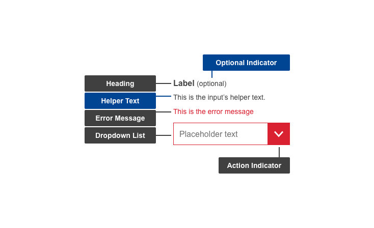
Anatomy
Default
| Elements | Mandatory | Description |
|---|
| heading | yes | heading describes the options in the Select Menu |
| helper text | no | helper text information assists a user in using Select Menu |
| dropdown list | yes | dropdown in the collapsed state with placeholder giving instructions for using the Dropdown Select |
| action indicator | yes | displays listed items on click |
Conditional (missing input)
| Elements | Mandatory | Description |
|---|
| optional indicator | yes | indicator stating if input fields are optional |
| error message | yes | a message informing the user if there is a problem with their entry |
Do's
- write short, distinct and indicative headings for the items listed inside the dropdown
- use dropdown select menu labels as click targets (clicking the label will trigger the action)
- indicate whether the input is optional
- make use of helper text if there are further directions or hints the users may need in completing their goal (example: you must be a current resident of this country)
- write specific and clear error message texts, so users understand how to address the error
Don'ts
- don't use as navigation
- don't use it for multiple select - use Multi-dropdown select instead
When to use
- when there are more than 10 options to select from
When not to use
- when you want users to read all options
Related components
Multi-dropdown select
The Multi-dropdown select is a variation of the Single-select dropdown, and displays a list of selectable items from which the user can select one or more values.
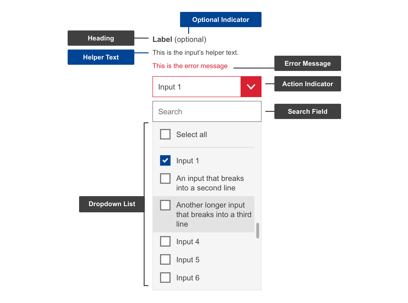
Anatomy
Default
| Elements | Mandatory | Description |
|---|
| heading | yes | heading describes the options in the Select Menu |
| helper text | no | helper text information assists a user in using Select Menu |
| dropdown list | yes | dropdown in the collapsed state with placeholder giving instructions for using the Dropdown Select |
| action indicator | yes | displays listed items on click |
Conditional (missing input)
| Elements | Mandatory | Description |
|---|
| optional indicator | yes | indicator stating if input fields are optional |
| error message | yes | a message informing the user if there is a problem with their entry |
Do's
- write short, distinct and indicative headings for the items listed inside the dropdown
- use dropdown select menu labels as click targets (clicking the label will trigger the action)
- indicate whether the input is optional
- make use of helper text if there are further directions or hints the users may need in completing their goal (example: you must be a current resident of this country)
- write specific and clear error message texts, so users understand how to address the error
Don'ts
- don't use as navigation
- don't use it for single select - use Single-dropdown select instead
When to use
- when there are more than 5 options to select from
When not to use
- when you want users to read all options