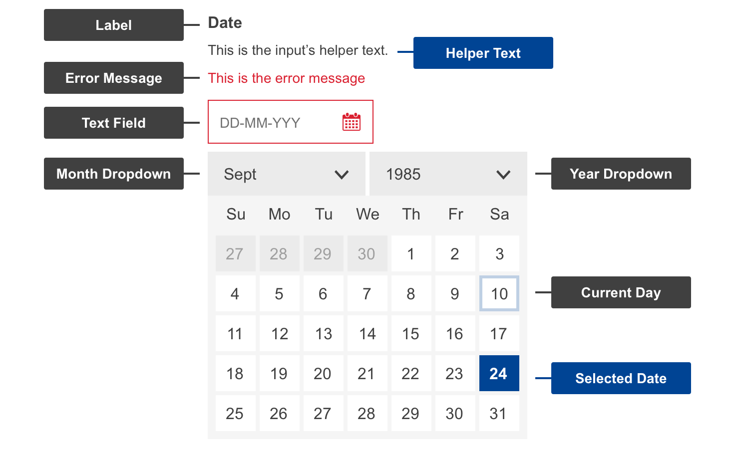
The Date Picker is an input field that allows users to choose a date and year.
Anatomy
Default
| Elements | Mandatory | Description |
|---|
| label | yes | Date |
| text field | yes | Input area of selected date and year |
| icon | yes | Visual of calendar to invoke the action |
| month dropdown | yes | Dropdown of months |
| year dropdown | yes | Dropdown of years |
| current date | yes | Indication of the current date |
| selected date | no | Indication of the selected date |
Conditional
| Elements | Mandatory | Description |
|---|
| error message | yes | a message informing the user if there is a problem with their entry |
Do's
- allow the users to type in the date and year directly when it is needed
- date format should be clear and understandable to users
- full name of months are spelled out
Don'ts
- don't enter special characters to format dates in text field
When to use
- when the complete date entry (DD-MM-YYYY) is required, not partial (only a year or month or date, for example)
- when making a selection of the date is needed
When not to use
- when manual text input is not available