Buttons allow the user to interact with the front or back end of the web page.
Call to action (CTA) button
CTAs help direct users' attention to the most important action on the page, making it easier to scan content and direct attention towards the intended action.
Anatomy
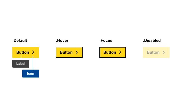
- mandatory
- optional
| Elements | Mandatory | Description |
|---|---|---|
| label | yes | label of the button |
| icon | no | affordance or action indicator that compliments the label or adds an indicator |
Do's
- ensure the button directs to a pre-defined goal, such as 'Search by priority'
Don'ts
- do not use more than once per page (except where the main action or user goal is repeated on the same page)
When to use
- when you have a main goal you want to direct users to
When not to use
- do not use for site navigation
Notes
Design
- links can also be styled as CTAs when the goal linked to the main action is navigation
Positioning
- positioned on the bottom left of the container, following written content principles
Primary Button
Primary buttons are used for main actions. The design uses a high contrast compared to the background, ensuring an easily distinguishable visual hierarchy.
Anatomy
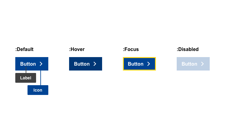
- mandatory
- optional
| Elements | Mandatory | Description |
|---|---|---|
| label | yes | label of the button |
| icon | no | affordance or action indicator that compliments the label or adds an indicator |
Do's
- make sure the buttons' microcopy represents the action the system will run, such as 'Submit' or 'Register'
Don'ts
- don't assign an action that should be assigned for a CTA
When to use
- when you have one main action or user goal per section of content
When not to use
- do not use for site navigation
- do not use for downloads
- do not use when the primary action is negative - use secondary or ghost buttons instead
Notes
Positioning
- position at the bottom right corner - as this is the last place users will look according to normal F-shaped reading patterns
Secondary Button
Ghost buttons should only be used to highlight the priority of an action that should be distinguishable from other buttons. They can either be used to indicate a negative primary action, along with a primary action, or for non-primary actions.
Anatomy
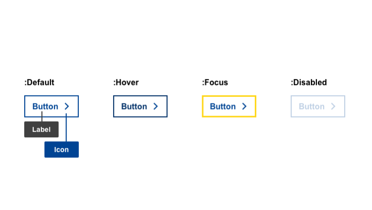
- mandatory
- optional
| Elements | Mandatory | Description |
|---|---|---|
| label | yes | label of the button |
| icon | no | affordance or action indicator that compliments the label or adds an indicator |
Do's
- make sure the buttons represents the action the system will run, such as 'Cancel', 'Delete', 'Remove' or 'Replace'
Don'ts
- do not use for primary positive actions
- do not use on its own
When to use
- use whenever you have multiple actions per section of content
- to indicate primary negative action, in conjunction with a primary button
When not to use
- do not use for navigation
Notes
Positioning
- if used with another button, position complementary to the primary button
Text Button
Text buttons are used on a page where content should be the focus.
Anatomy
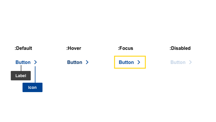
- mandatory
- optional
| Elements | Mandatory | Description |
|---|---|---|
| label | yes | label of the button |
| icon | no | affordance or action indicator that compliments the label or adds an indicator |
Do's
- use on it's own
- make sure the button represents the action the system will run, such as 'Show more', 'Expand or 'See details')
Don'ts
- don't use for primary actions
When to use
- use it whenever you have multiple actions per section of content as the Text buttons do not create visual distraction
- use on pages/cards when the main focus should be the content and not the button
- when there is a single action intended
When not to use
- do not use for navigation
Notes
Design
- don't underline in order to not have them confused with links
Positioning
- positioned on the bottom left of the container, following written content principles
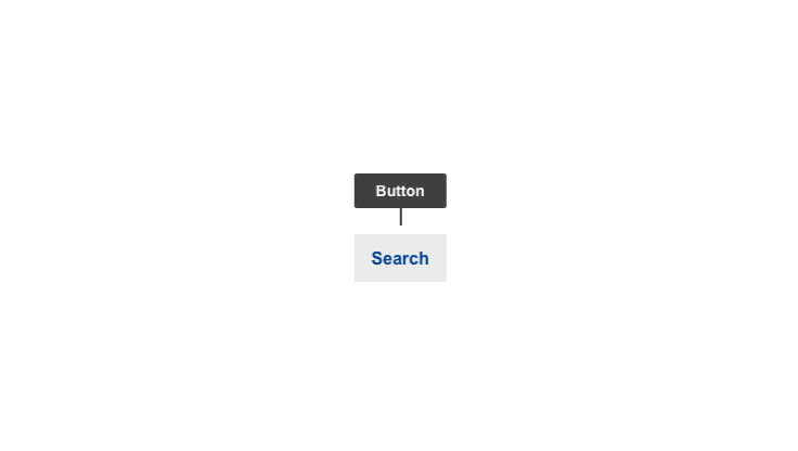
Search Button
The search button is only used with the search form.
Anatomy
- mandatory
- optional
| Elements | Mandatory | Description |
|---|---|---|
| label | yes | label of the button |
| icon | no | icon replacing the word 'search' on the mobile version |
Do's
- use exclusively for the search function
Don'ts
When to use
- always when a search form is used
When not to use
- do not use for navigation
- do not use for submitting any forms other than searc
Notes
Design
- don't underline
Positioning
- positioned within the search form container
Genral Notes
Accessibility
- ensure buttons are tagged with the
<button>tag, in accordance with the WCAG2 for easy accessibility - ensure the positive selection comes first and the negative second, such as 'Would you like to continue? Yes or No'
Design
- positive primary action
- a primary action should be distinguishable from the secondary/ghost button

- a primary action should be distinguishable from the secondary/ghost button
- negative primary action
- a negative primary action should be less visually contrasting as it can cause negative consequences when used accidentally - use solid button for Secondary action and ghost button for Primary action

- a negative primary action should be less visually contrasting as it can cause negative consequences when used accidentally - use solid button for Secondary action and ghost button for Primary action