
Eurostat has started to change the maps displayed under "Statistics Illustrated" in each statistical section.
This work is on-going, which explains why in some statistical sections you will still find maps with the previous design and in some sections maps with the new look and feel. We aim to have all the maps replaced by end March.
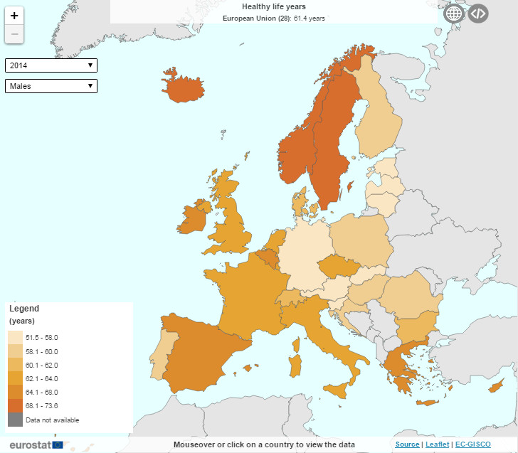
You can find an example of a map with the new look in the section "Health".
The new map offers the following functionalities:
- change the year by selecting it from the drop down list on the left hand side
- change the dimension by selecting a different option from the drop down list
- mouse over a country to see the exact data displayed in the bottom line
- click on a country to compare it with other EU Member States or to display a time series
- click on the European Union and Euro Area displayed below the map's title to see more detailed data for these aggregates
- zoom in and out by clicking on the + or – sign on the left hand side
- click on
 to add the inlets to the map
 - click on
 to receive an embed code for this map
 - click on "Source" at the bottom right to be directed to the full dataset
We hope you like the look and performance of our new maps. Please send your comments and feedback to the Eurostat Internet team.